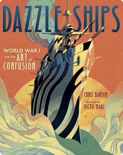
Dazzle Ships: World War I and the Art of Confusion
During World War I, British and American ships were painted with bold colors and crazy patterns from bow to stern. Why would anyone put such eye-catching designs on ships?
Desperate to protect ships from German torpedo attacks, British lieutenant-commander Norman Wilkinson proposed what became known as dazzle. These stunning patterns and colors were meant to confuse the enemy about a ship's speed and direction. By the end of the war, more than four thousand ships had been painted with these mesmerizing designs.
Author Chris Barton and illustrator Victo Ngai vividly bring to life this little-known story of how the unlikely and the improbable became just plain dazzling.